The brand uses symbols and colors of nature to reflect the Company's unbreakable bond with the environment.
At the same time, the unique graphic elements express key technological processes related to manufacturing of our products.
The combination of two colors – yellow and cold green – is aimed at reminding us of a softwood forest and bright sunshine
Logo
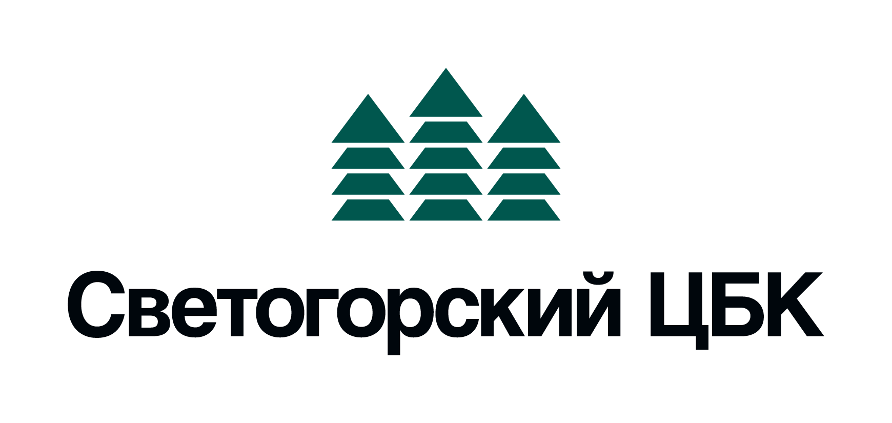
Our Company’s logo is a graphic image of spruce trees combined with the Company’s name. Spruces are a part of the history and heritage of Svetogorsk Mill and they symbolize tradition in graphic images.
Spruce trees are the symbol of the Leningrad Region forests reflecting the Company's close connection with the town of Svetogorsk, as its coat of arms features this kind of trees.
Spruce is also the fundamental element of the pulp and paper industry that represents our commitment to follow sustainable forestry practices all the time
Graphic Elements
Use of graphic elements constitutes the main graphic technique and an important component of corporate identity. The elements reflect some stages of the production process.
For example, the main graphic element “Paper Sheet Formation” not only demonstrates one of the key technological processes, but it also symbolizes several products: office and offset papers, board and CTMP.
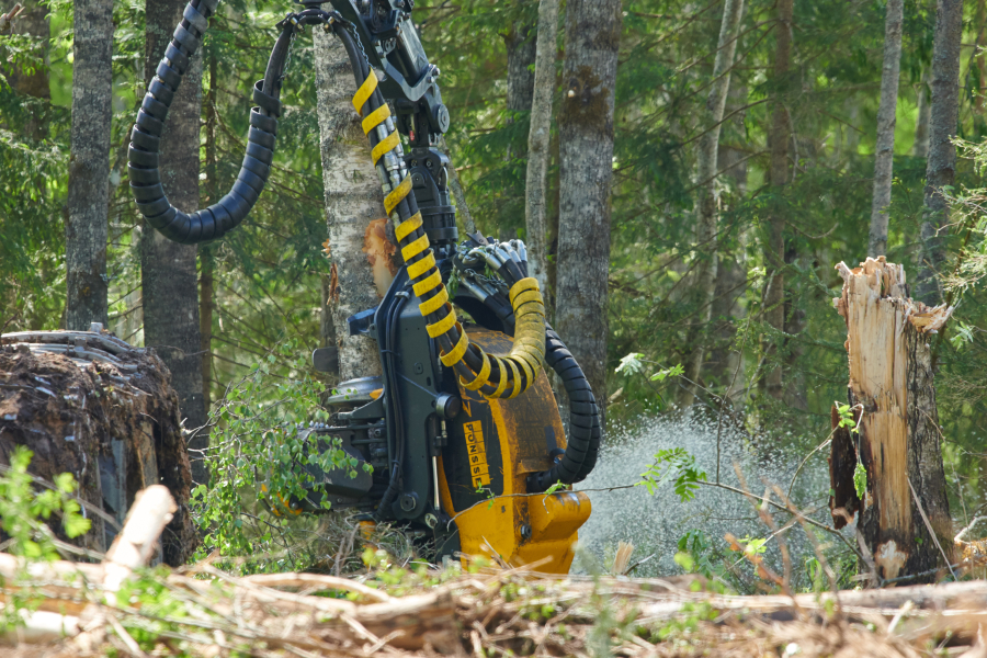
The graphic elements “Pulp”, “Wood”, “Cut-size Paper” represent additional images.
Together all these elements define a unique graphic language of the Company
